Discover Card and amazon prime offer


Challenge :
Marketing initiative required a very fast turn-around time frame; needed to include amazon branding, while showcasing the partnership offer from both Discover Card and amazon.
Solution :
Creative was supplied within 3 business days, from concept to completion. adding the amazon branding to the delivery box reinforces the amazon delivery message, as well as the amazon prime offer, in a strong, quick visual. the added credit card photography for discover also sealed the partnership requirement.
Discover Card and Shell Gasoline offer


Challenge :
Use strong branding provided by both Shell Gasoline and Discover Card for this important summer time marketing message. Shell had some very stringent branding guidelines to follow; mainly in text communication. Lots of visuals were provided to consider.
Solution :
The resulting creative included stock imagery that was combined from 3 separate sources (for the road, sky, and vegetation). Similar to other Discover Card projects, this particular marketing piece was also required within a severely compressed time frame.
Discover Card Referral Program offer


Challenge :
Typographic message needed to be strongly integrated with imagery. Message would be used in a multitude of formats; potentially TV, Internet, email, as well as print (buck slips and bulletin boards / environmental graphics).
Solution :
A simple image was developed to reinforce the quick punch of the typography and bullet pointed message. I worked with Discover Card and the on-site illustrator on the refinement of the paper doll images. Also, I illustrated a flat version as well, as a secondary option for consideration.
Loyal Values Program offer

Challenge :
The client wanted to have a lot of information presented in this banner ad. The solution also needed to be served up and function properly on differing devices. Flash ads were restricted, due to cross-compatibility limitations.
Solution :
The ad needed to display properly in a variety of use cases; specifically within email, on the web, and on iPhones. Therefore, a Flash option, as mentioned above, was off the table. A heavier weight animated .gif was the preferred approach, in result. This ad captures all the client wanted to showcase, but it is also animates in a way resembling a Flash-based solution.
Quill Stapler Sale
Challenge :
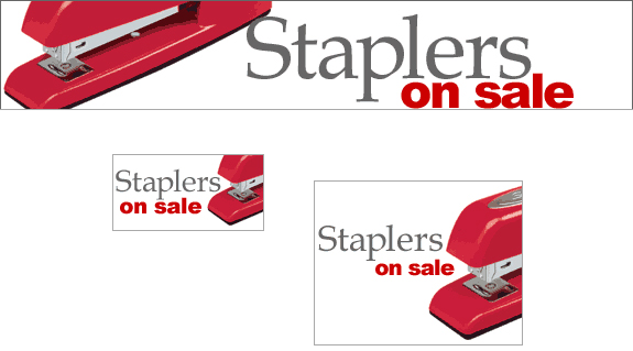
By nature of the Quill.com site, and customer expectations, many of the advertisements were visually busy and content-heavy. The product manager who I worked with on this particular sales promotion was open to my idea of streamlining things a bit.
Solution :
The elegant approach actually gained more click throughs and sales orders on the web than any other stapler promotion offered to date. Ironically enough, this creative was also developed shortly after the film, 'Office Space' was released to video. There's no doubt the movie industry might have also helped reinforce this initiative.
Zoro email header

Challenge :
Email headers needed to be clean and deliver a memorable branding message, while yielding attention of the viewer to the offer and products contained within the body of the email communication. Also necessary was a light-weight approach (in file size), so the emails loaded relatively quickly for on-line customers connected via slower bandwidths.
Solution :
I worked with product management to narrow in on a few, specific and strong representational products to quickly and succinctly showcase products and tools for the marketplace. I art directed the photography, as well as cleaned up the raw photos using Photoshop. Finally, all of the individual photographs were color-corrected and included in a single image for this masthead solution.
Zoro Father's Day email header
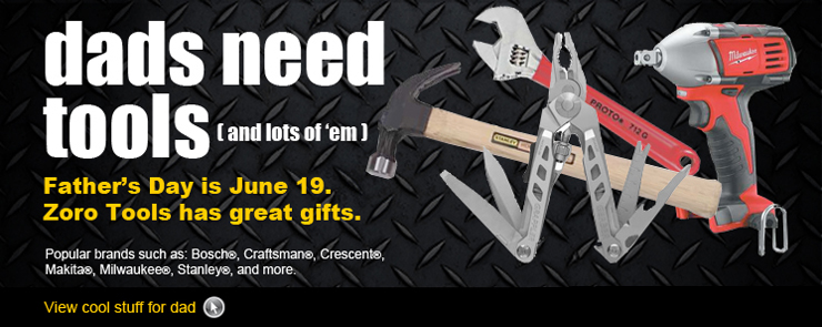
Challenge :
Father's day promotions are important to the tool and supply market, in terms of marketing and sales. This unique Father's Day promotional email proved no different. A masculine image and striking design was needed for the 2011 summer selling season.
Solution :
The predominant color black, only with an anti-slip flooring pattern was chosen for the backdrop. Tools, images and predominate red and yellow typography was provided in order to create a strong and visual pop. Careful consideration was given to the typefaces chosen as well; again, reinforcing the masculine sales message.
Zoro Hurricane Preparedness email header

Challenge :
Banner needed to show hurricane prep items, despite being planned and marketed after a set of storms had reached land fall on the East coast of The United States.
Solution :
Imagery chosen was of the hurricane flags (an international recognized communication). Also planned was showcasing a blue, rather than dark sky; even though actual hurricane photography was included. I also wanted to pay homage to the destructive nature of hurricanes despite the marketing approach was to not dwell on damage aftermath. Therefore, typography featuring a bit of an organic, unstable feel was chosen in regards.
